
sidebar
: a beloved neighorhood establishment - reimagined
This longtime Grand Lake institution has floor to ceiling windows that open up to views of Lake Merritt, creating an open air vibe that spills out on the sidewalk. New ownership wanted to maintain the feeling of a classic, no-frills neighborhood restaurant, but with elevated, seasonal fare. They were looking for an updated, timeless brand refresh with a whisper of nostalgia & quirk.

- new voice, who dis?
At its core, Sidebar is a community space that exists to invite a diverse set of local friends and neighbors in night after night. It is important to communicate a commitment to quality and care, in an unpretentious and friendly fashion. Plain language over chef-y, high-brow connotations; be approachable and unassuming.
brand tagline
"an old-school neighborhood eatery, with timeless appeal and a modern approach, Sidebar is where Oakland's past meets its present. Sit beside Lake Merritt and enjoy classic cocktails, good food, cold beer, and nice wine."
brand slogan
"a locals' establishment"
- approach
aesthetic ethos
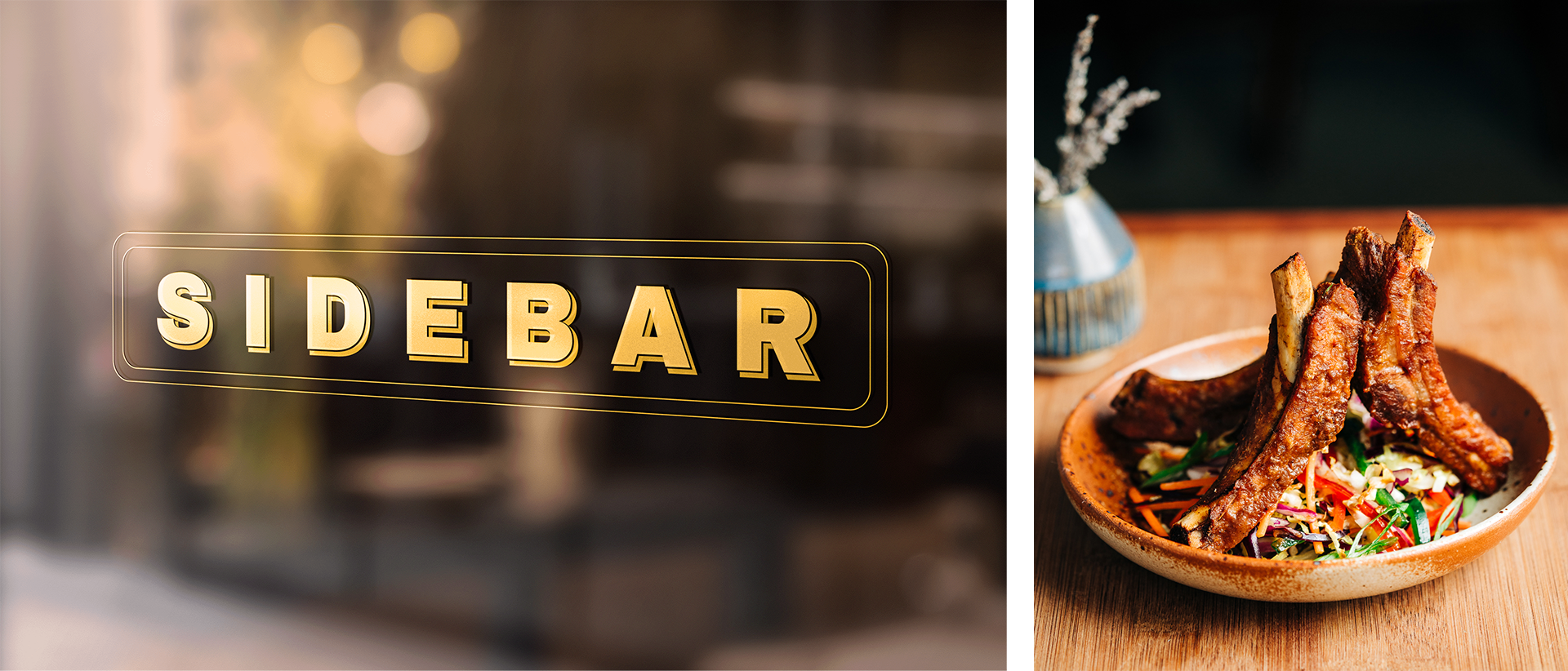
The logo was designed to exude an unfussy, dressed down quality. Taking inspiration from the bold san-serif signage along the top of the storefront, a longtime part of the local vernacular, I opted for Archivo Black, which could stand up to exaggerated kerning, mimicking the open-air experience inside the restaurant. I elongated the bowls and rounded the edges subtly for a hand-painted vibe.

visual language
Typefaces, leader dots and boxes referencing retro diner menus are the organizing principle across informational collateral. The building illustration, a stand-in for the logo, serves to communicate the quirky, bespoke quality that makes a place beloved, and break up the repetition of the main logo, which needs the playfulness of supporting characters. Green was going to figure prominently in the remodel, and so too plays a large role, with an otherwise tight and classic palate.


sidelong light
friendly illustrations reinforce the branded tagline across menus and collateral, and mimic the light that pours in through the front windows, which cast dancing shadows across the restaurant as the sun wanes. Photo direction communicates an easy, welcoming vibe with hands of service, and soft, warm directional light.


.gif)